


Book Jacket Commission
- Liv

- Jul 20, 2025
- 3 min read
This was a commission for an acquaintance who wanted their DND character and story as a book cover. They gave me a reference to the character, which is shown here.

Before I started on the layout of the book design, I wanted to map out the cover for her. Creating a moodboard based on this reference given here. I wanted to give the feel of the magical fantasy elements that she was going for. In this image, the person has stated that this was at the end of the character's story and plot, so I wanted to make sure that the character would look a little younger and a little more naive.
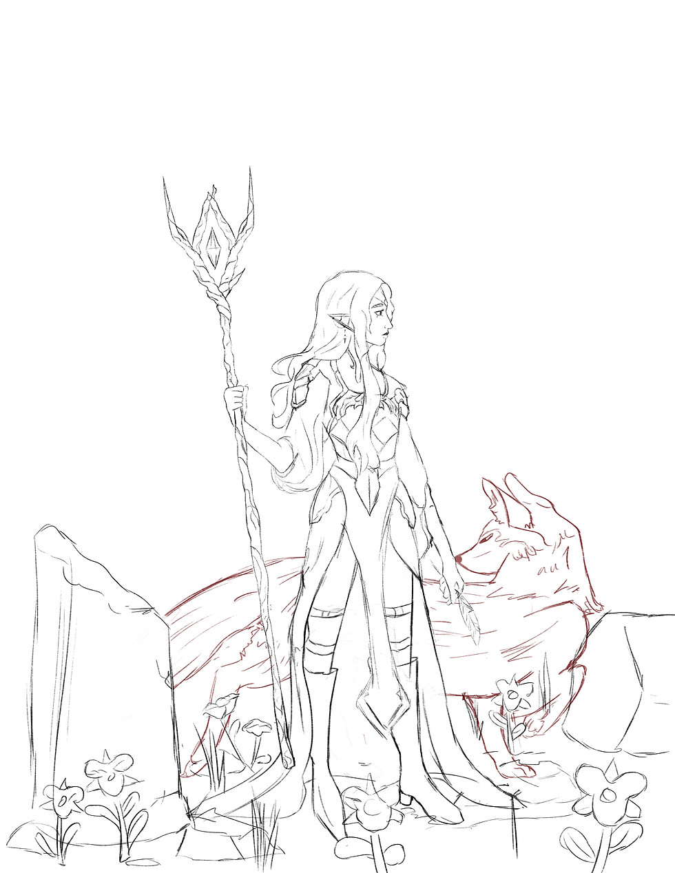
Here I gave the initial sketch for the client. I wanted to highlight the important features while making her seem more unsure of herself, as this was the start of her journey. With a few comments and suggestions on feedback from the client, she loved the sketch, and we went ahead and proceeded.
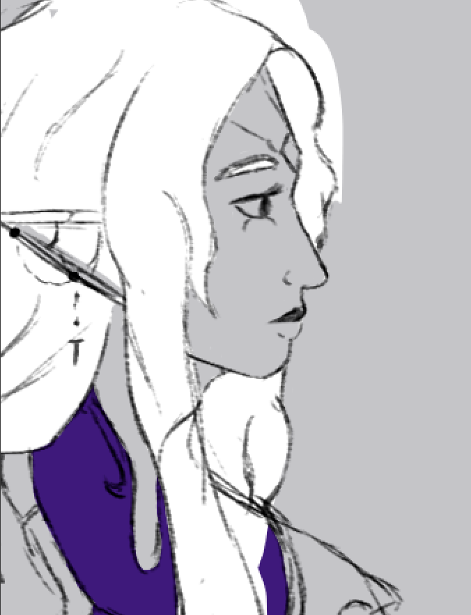
While I got started on the color, proper line art, and finer details. The most difficult challenge I had to tackle was the colors for the cover. I wanted certain features like the character's hair to POP! I also wanted the background to be vibrant and heavy, but not to overwhelm the viewer, so I went back and forth between many color variations and changes.
The background was additionally a challenge for me, normally because I am very minimal and abstract with my backgrounds, but this time around, I wanted to be able to give depth to the illustration. I also didn't want the character to seem like she was floating in space with nothing grounding her in reality. However, I didn't want the landscape to be detail-heavy as the character had more of a flat layered look. I think it would look too disconnected if I did that. So I added light shading and textures to the back environment to make it seem more detailed without overwhelming the eyes. Even thinking and considering the title of the book cover, I didn't want the type to be washed out.

With one final look over before the client was fully satisfied, here we have the final result of the cover illustration for her Book.

While creating the cover, I wanted a font that felt like it came from a fantasy world but, wasn't too overwhelming because the in the case of this Jacket I wanted the art work to be the main focus, and if I put in a overly intricate font, then the art and the typeography would be fighting for attention. After many trials and errors to see which would be the most fitting, I ended up going with the font called Press Jobs for the jacket flaps and back. I wanted it to be a tad simpler compared to the cover. So for the flaps, I ended up doing the pinkish-light blue gradient.


With the edges of the dust jacket, I chose the fonts Cinzel for the synopsis of the book and then Book Antiqua for the author Bio. The client sent me both to put in. I had different fonts as I wanted the synopsis to fit the cover while having the font for the author bio not be as in-your-face. Since the synopsis is next to the cover art, I wanted that to correlate more with the art to keep the viewer more engaged in the front. Once I showed the client the final turnaround for the dust jacket, she was extremely happy with it, and then I was able to provide mockups for her for what the book would look like if it had a physical product. For the inside pages, I chose a dark, minimal repeating pattern that correlated with the design of the dust jacket, making the design as a whole feel unified. I also had the pages of the book give a light blue-green hue to them, to make the book feel extra special for the reader.


This was an extremely fun project to work on with the client! I do hope one day her story can be published for all to see!
Comments